Goddard, Watts and data adjustments
Has the recent “discussion” between Steven Goddard and Anthony Watts finally advanced publicity on the questionable data management practices by NOAA? For a long time the Real Science blog has highlighted the temperature adjustments being made by NOAA in the USHCN final temperature data. The adjustments include making the past colder while making recent temperatures warmer, resulting in climate change that looks more like the model predicted climate change. The blog proprietor, “Steven Goddard” calls the missing data “fabricated.” A significant amount of station data are infilled by algorithms and the results of those fabrications seem to uniformly result in higher recent temperatures. Goddard got much less notice than he deserved for his work until it was finally picked up by the news.Wattsupwiththat picked up the Goddard posts with a series of blog posts “On denying ‘Hockey sticks,’ USHCN data, and all that” Part I and Part 2. Along with some history of past disputes between Watts and Goddard was a pretty good discussion on methodology. Goddard uses the difference between raw and adjusted data to look at “adjustments.” Watt’s consensus was that this method had problems. There was a curious statement in Part 2 that the raw data can’t be used because it is too polluted. (If it’s too polluted for a difference analysis, what can it be used for?)
During this discussion Paul Homewood at Not A Lot of People Know That published “Massive Temperature Adjustments at Luling, Texas,” showing significant temperature adjustments up 1.35°C for 2013 and down (-0.91°C) for 1934. Homewood also noticed that the USHCN data showed a significant number of E’s for estimated when the Texas Meteorologist’s office had complete data. This seems to result in a flurry of findings of estimated data showing up in the NOAA database and being shown as complete in other places. As a minimum, NOAA has a significant data quality problem.
On June 28, Wattsupwiththat, posted “The scientific method at work on USHCN temperature data set” in which he gives Goddard credit for being right about the management of dead stations in the USHCN data set. Dr. Judith Curry’s blog also had an excellent post on the issue. The comments in these two posts are well worth scanning. It will give you some hint on thinking behind adjustments to the data. I particularly like Anthony Watts rather repeated comments “When 80% of your network is compromised by bad siting, what makes you think those neighboring stations have any data thats worth a damn? You are adjusting bad data with…drum roll….more bad data.” Pretty well sums up the problem.
We’re betting a sizable portion of the US economy on a poorly maintained data set with lots of glittering errors in adjustments?
On ‘denying’ Hockey Sticks, USHCN data, and all that – part 1
Part 2 is now online here.One of the things I am often accused of is “denying” the Mann hockey stick. And, by extension, the Romm Hockey stick that Mann seems to embrace with equal fervor.
While I don’t “deny” these things exist, I do dispute their validity as presented, and I’m not alone in that thinking. As many of you know Steve McIntyre and Ross McKitrick, plus many others have extensively debunked statistics that went into the Mann hockey stick showing where errors were made, or in some cases known and simply ignored because it helped “the cause”.
The problem with hockey stick style graphs is that they are visually compelling, eliciting reactions like whoa, there’s something going on there! Yet, oftentimes when you look at the methodology behind the compelling visual you’ll find things like “Mike’s Nature Trick“. The devil is always in the details, and you often have to dig very deep to find that devil.
Just a little over a month ago, this blog commented on the hockey stick shape in the USHCN data set which you can see here:

The graph above was generated by” Stephen Goddard” on his blog and it generated quite a bit of excitement and attention.
At first glance it looks like something really dramatic happened to the data, but again when you look at those devilish details you find that the visual is simply an artifact of methodology. Different methods clearly give different results and the”hockey stick” disappears when other methods are used.

The graph above is courtesy of Zeke Hausfather Who co-wrote that blog entry with me. I should note that Zeke and I are sometimes polar opposites when it comes to the surface temperature record. However, in this case we found a point of agreement. That point was that the methodology gave a false hockey stick.
I wrote then:
While Goddard’s code and plot produced a mathematically correct result, the procedure he chose (#1 The All Absolute Approach) comparing absolute raw USHCN data and absolute finalized USHCN data, was not, and it allowed non-climatic differences between the two datasets, likely caused by missing data (late reports) to create the spike artifact in the first four months of 2014 and somewhat overstated the difference between adjusted and raw temperatures by using absolute temperatures rather than anomalies.Interestingly, “Goddard” replied and comments with a thank you for helping to find the reason for this hockey stick shaped artifact. He wrote:
stevengoddard says:
http://wattsupwiththat.com/2014/05/10/spiking-temperatures-in-the-ushcn-an-artifact-of-late-data-reporting/#comment-1632952 May 10, 2014 at 7:59 am
Anthony,Lesson learned. It seemed to me that was the end of the issue. Boy, was I wrong.
Thanks for the explanation of what caused the spike.
The simplest approach of averaging all final minus all raw per year which I took shows the average adjustment per station year. More likely the adjustments should go the other direction due to UHI, which has been measured by the NWS as 8F in Phoenix and 4F in NYC.
A couple of weeks later in e-mail Steven Goddard circulated a new graph with a hockey stick shape which you can see below. He wrote to me and a few others on the mailing list this message:
Here is something interesting. Almost half of USHCN data is now completely fake.

http://stevengoddard.wordpress.com/2014/06/01/more-than-40-of-ushcn-station-data-is-fabricated/
After reading his blog post I realized he had made a critical error and I wrote back an e-mail the following:
This claim: “More than 40% of USHCN final station data is now generated from stations which have no thermometer data.”What I was objecting to was the claim if 40% of the USHCN network was missing – something I know from my own studies to be a false claim.
Is utterly bogus.
This kind of unsubstantiated claim is why some skeptics get called conspiracy theorists. If you can’t back it up to show that 40% of the USHCN has stopped reporting, then don’t publish it.
He replied back with a new graph and the strawman argument and a new number:
The data is correct.The problem was, I was not disputing the data, I was disputing the claim that 40% of USHCN stations were missing and had “completely fake” data (his words). I knew that to be wrong. So I replied with a suggestion.
…
Since 1990, USHCN has lost about 30% of their stations, but they still report data for all of them. This graph is a count of valid monthly readings in their final and raw data sets.

On Sun, Jun 1, 2014 at 5:13 PM, Anthony wrote:
Later when I returned, I noted a change had been made to Goddard’s blog post. The word “fabrication” remained but made a small change with no mention of it to the claim about stations. Since I had open a new browser window I had the before and after that change which you can see below:I have to leave for the rest of the day, but again I suggest you take this post down, or and the very least remove the title word “fabricated” and replace it with “loss” or something similar.Not knowing what your method is exactly, I don’t know how you arrived at this, but I can tell you that what you plotted and the word “fabricated” don’t go together they way you envision.Again, we’ve been working on USHCN for years, we would have noticed if that many stations were missing.Anthony
I thought it was rather disingenuous to make that change without noting it, but I started to dig a little deeper and realized that Goddard was doing the same thing he was before when we pointed out the false hockey stick artifact in the USHCN; he was performing a subtraction on raw versus the final data.
I then knew for certain that his methodology wouldn’t hold up under scrutiny, but beyond doing some more private e-mail discussion trying to dissuade him from continuing down that path, I made no blog post or other writings about it.
Four days later, over at Lucias blog “The Blackboard” Zeke Hausfather took note of the issue and wrote this post about it: How not to calculate temperature
Zeke writes:
The blogger Steven Goddard has been on a tear recently, castigating NCDC for making up “97% of warming since 1990″ by infilling missing data with “fake data”. The reality is much more mundane, and the dramatic findings are nothing other than an artifact of Goddard’s flawed methodology.Now again, I’d like to point out that Zeke and I are often polar opposites when it comes to the surface temperature record but I had to agree with him on this point; the methodology created the artifact. In order to properly produce a national temperature gridding must be employed, using the raw data without gridding will create various artifacts.
…
Goddard made two major errors in his analysis, which produced results showing a large bias due to infilling that doesn’t really exist. First, he is simply averaging absolute temperatures rather than using anomalies. Absolute temperatures work fine if and only if the composition of the station network remains unchanged over time. If the composition does change, you will often find that stations dropping out will result in climatological biases in the network due to differences in elevation and average temperatures that don’t necessarily reflect any real information on month-to-month or year-to-year variability. Lucia covered this well a few years back with a toy model, so I’d suggest people who are still confused about the subject to consult her spherical cow.
His second error is to not use any form of spatial weighting (e.g. gridding) when combining station records. While the USHCN network is fairly well distributed across the U.S., its not perfectly so, and some areas of the country have considerably more stations than others. Not gridding also can exacerbate the effect of station drop-out when the stations that drop out are not randomly distributed.
The way that NCDC, GISS, Hadley, myself, Nick Stokes, Chad, Tamino, Jeff Id/Roman M, and even Anthony Watts (in Fall et al) all calculate temperatures is by taking station data, translating it into anomalies by subtracting the long-term average for each month from each station (e.g. the 1961-1990 mean), assigning each station to a grid cell, averaging the anomalies of all stations in each gridcell for each month, and averaging all gridcells each month weighted by their respective land area. The details differ a bit between each group/person, but they produce largely the same results.
Spatial interpolation (gridding) for a national average temperature would be required in a constantly changing dataset, such as GHCN/USHCN, no doubt, gridding is a must. For a guaranteed quality dataset, where stations will be kept in the same exposure, producing reliable data, such as the US Climate Reference Network (USCRN), you could in fact use the raw data as a national average and plot it. Since it is free of the issues that gridding solves, it would be meaningful as long as the stations all report, don’t move, aren’t encroached upon, and don’t change sensors- i.e. the design and production goals of USCRN.
Anomalies aren’t necessarily required, they are an option depending on what you want to present. For example NCDC gives an absolute value for the national average temperature in their State of the Climate report each month, they also give a baseline and the departure anomaly from that baseline for both CONUS and Global temperature.
Now let me qualify that by saying that I have known for a long time that NCDC uses in filling of data from surrounding stations as part of the process of producing a national temperature average. I don’t necessarily agree with their methodology as being perfect, but it is a well-known issue and what Goddard discovered was simply a back door way of pointing out that the method exists. It wasn’t news to me and to many others who have followed the issue.
This is why you haven’t seen other prominent people in the climate debate ( Spencer, Curry, McIntyre, Michaels, McKitrick) and even myself make a big deal out of this hockey stick of data difference that Goddard has been pushing. If this were really an important finding you can bet they and yours truly would be talking about it and providing support and analysis.
It’s also important to note that Goddards graph does not represent a complete loss of data from these stations. The differencing method that Goddard is using detects every missing data point from every station in the network. This could be as simple as one day of data missing in an entire month, or a string of days, or even an entire month which is rare. Almost every station in the USHCN at one time or another is missing some data. One exception might be the station at Mohonk Lake, New York which has a perfect record due to a dedicated observer, but has other problems related to siting.
If we were to throw out an entire month’s worth of observations because one day out of 31 is missing, chances are we’d have no national temperature average at all. So the method was created to fill in missing data from surrounding stations. In theory and in a perfect world this would be a good method, but as we know the world is a messy place, and so the method introduces some additional uncertainty.
The National Cooperative Observer network a.k.a. co-op is a mishmash of widely different stations and equipment. the co-op network is a much larger set of stations than the USHCN. The USHCN is a subset of the larger co-op network comprising some 8000 stations around the United States. Some are stations in Observer’s backyards, or at their farms, some are at government entities like fire stations and Ranger stations, some are electronic ASOS systems at airports. The vast majority of stations are poorly sited as we have documented using the surface station project, by our count 80% of the USHCN as poorly sited stations. The real problem is with the micro-site issues of the stations. this is something that is not effectively dealt with in any methodology used by NCDC. We’ll have more on that later but I wanted to point out that no matter which data set you look at (NCDC, GISS, HadCRUT, BEST) the problem of station siting bias remains and is not dealt with. for those who don’t know NCDC provides the source data for the other interpretations of the surface temperature record, so they all have it. More on that later, perhaps in another blog post.
When it was first created the co-op network was done entirely on paper forms called B – 91′s. the observer would write down the daily high and low temperatures along with precipitation for each day of the month and then at the end of the month mail it in. An example B-91 form from Mohonk Lake, NY is shown below:

Not all forms are so well maintained. Some B-91 forms have missing data, which can be due to the observer missing work, having an illness, or simply being lazy:

The form above is missing weekends because the secretary at the fire station doesn’t work on weekends and the firefighters aren’t required to fill in for her. I know this having visited this station and I interviewed the people involved.
So, in such an imperfect “you get what you pay for” world of volunteer observers, you know from the get-go that you are going to have missing data, and so, in order to be able to use any of these at all, a method had to be employed to deal with it, and that was infilling of data. This has been a process done for years, long before Goddard “discovered” it.
There was no nefarious intent here, NOAA/NCDC isn’t purposely trying to “fabricate” data as Goddard claims, they are simply trying to be able to figure out a way to make use of it at all. The word “fabrication” is the wrong word to use, as it implies the data is being plucked out of thin air. It isn’t – it is being gathered from nearby stations and used to create a reasonable estimate. Over short ranges one can reasonably expect daily weather (temperature at least, precip not so much) to be similar assuming the stations are similarly sited and equipped but that’s where another devil in the details exists.
Back when I started the surfacestations project, I noted one long-period well sited station, Orland was in a small sea of bad stations, and that its temperature diverged markedly from its neighbors, like the horrid Marysville Fire station where the MMTS thermometer was directly next to asphalt:
![marysville_badsiting[1]](https://wattsupwiththat.files.wordpress.com/2014/06/marysville_badsiting1.jpg)
Orland is one of those stations that reports on paper at the end of the month. Marysville (shown above) reported daily using the touch-tone weathercoder, so its data was available by the end of each day.
What happens in the first runs of the NCDC CONUS temperature process is that they end up with mostly the airports ASOS stations and the weathercoder stations. The weathercoder reporting stations tend to be more urban than rural since a lot of observers don’t want to make long distance phone calls. And so in the case of missing station data on early in the month runs, we tend to get a collection of the poorer sited stations. The FILNET process, designed to “fix” missing data goes to work, and starts infilling data.
A lot of the “good” stations don’t get included in the early runs, because the rural observers often opt for a paper form mailed in rather than the touch-tone weathercoder, and those stations have data infilled from many of the nearby ones, “polluting” the data.
And we have shown back in 2012, those stations have a much lower century scale trend than than the majority of stations in the surface network. In fact, by NOAA’s own siting standards, over 80% of the surface network is producing unacceptable data and that data gets blended in.
Steve McIntyre noted that even in good stations like Orland, the data gets “polluted” by the process:
http://climateaudit.org/2009/06/29/orland-ca-and-the-new-adjustments/
So, imagine this going on for hundreds of stations, perhaps even thousands early on in the month.
To the uninitiated observer, this “revelation” by Goddard could look like NCDC is in fact “fabricating” data. Given the sorts of scandals that have happened recently with government data such as the IRS “loss of e-mails”, the padding of jobs and economic reports, and other issues from the current administration I can see why people would easily embrace the word “fabrication” when looking at NOAA/NCDC data. I get it. Expecting it because much of the rest of the government has issues doesn’t make it true though.
What is really going on is that the FILNET algorithm, design to fix a few stations that might be missing some data in the final analysis is running a wholesale infill on early incomplete data, which NCDC pushes out to their FTP site. The process gets to be less and less as the month goes on, as more data comes in.
But over time, observers have been less inclined to produce reports, and attrition in both the USHCN and and the co-op network is something that I’ve known about for quite some time having spoken with hundreds of observers. Many of the observers are older people and some of the attrition is due to age, infirmity, and death. You can see what I’m speaking of my looking through the quarterly NOAA co-op newsletter seen here: http://www.nws.noaa.gov/om/coop/coop_newsletter.htm
NOAA often has trouble finding new observers to take the place of the ones they have lost, and so, it isn’t a surprise that over time we would see the number missing data points rise. Another factor is technology many observers I spoke with wonder why they still even do the job when we have computers and electronics that can do the job faster. I explained to them that their work is important because automation can never replace the human touch. I always thank them for their work.
The downside is that the USHCN and is a very imperfect and heterogeneous network and will remain so; it isn’t “fixable” at an operational level, so statistical fixes are resorted to. That has both good and bad influences.
The newly commissioned USCRN will solve that with its new data gathering system, some of its first data is now online for the public.

Source: NCDC National Temperature Index time series plotter
Since this is a VERY LONG post, it will be continued…in part 2
In part 2 I’ll talk about things that we disagree on and the things we can find a common ground on.
Part 2 is now online here.
On ‘denying’ Hockey Sticks, USHCN data, and all that – part 2
In part one of this essay which you can see here, I got quite a lot of feedback on both sides of the climate debate. Some people thought that I was spot on with criticisms while others thought I had sold my soul to the devil of climate change. It is an interesting life when I am accused of being in cahoots with both “big oil” and “big climate” at the same time. That aside, in this part of the essay I am going to focus on areas of agreement and disagreement and propose a solution.In part one of the essay we focus on the methodology that was used that created a hockey stick style graph illustrating missing data. Due to the missing data causing a faulty spike at the end, Steve McIntyre commented, suggesting that it was more like the Marcott hockey stick than it was like Mann’s:
Anthony, it looks to me like Goddard’s artifact is almost exactly equivalent in methodology to Marcott’s artifact spike – this is a much more exact comparison than Mann. Marcott’s artifact also arose from data drop-out.
However, rather than conceding the criticism, Marcott et al have failed to issue a corrigendum and their result has been widely cited.
Despite some spirited claims in comments in part one about how I’m “ignoring the central issue”, I don’t dispute that data is missing from many stations, I never have.
It is something that has been known about for years and is actually expected in the messy data gathering process of volunteer observers, electronic systems that don’t always report, and equipment and or sensor failures. In fact there is likely no weather network in existence that has perfect data without some being missing. Even the new U.S. Climate Reference Network, designed to be state-of-the-art and as perfect as possible has a small amount of missing data due to failures of uplinks or other electronic issues, seen in red:

Source: http://www.ncdc.noaa.gov/crn/newdaychecklist?yyyymmdd=20140101&tref=LST&format=web&sort_by=slv
What is in dispute is the methodology, and the methodology, as McIntyre observed, created a false “hockey stick” shape much like we saw in the Marcott affair:
![marcott-A-1000[1]](http://wattsupwiththat.files.wordpress.com/2013/03/marcott-a-10001.jpg)
After McIntyre corrected the methodology used by Marcott, dealing with faulty and missing data, the result looked like this:
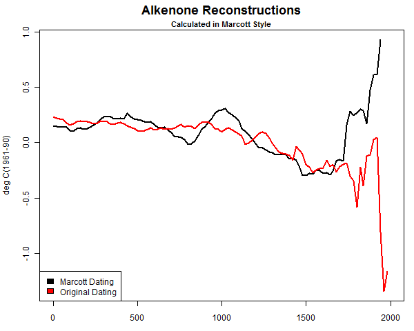
McIntyre points out this in comments in part 1:
In Marcott’s case, because he took anomalies at 6000BP and there were only a few modern series, his results were an artifact – a phenomenon that is all too common in Team climate science.So, clearly, the correction McIntyre applied to Marcott’s data made the result better, i.e. more representative of reality.
That’s the same sort of issue that we saw in Goddard’s plot; data was thinning near the endpoint of the present.

[ Zeke has more on that here: http://rankexploits.com/musings/2014/how-not-to-calculate-temperatures-part-3/ ]
While I would like nothing better than to be able to use raw surface temperature data in its unadulterated “pure” form to derive a national temperature and to chart the climate history of the United States, (and the world) the fact is that because the national USHCN/co-op network and GHCN is in such bad shape and has become largely heterogeneous that is no longer possible with the raw data set as a whole.
These surface networks have had so many changes over time that the number of stations that have been moved, had their time of observation changed, had equipment changes, maintenance issues,or have been encroached upon by micro site biases and/or UHI using the raw data for all stations on a national scale or even a global scale gives you a result that is no longer representative of the actual measurements, there is simply too much polluted data.
A good example of polluted data can be found in Las Vegas Nevada USHCN station:

Here, growth of the city and the population has resulted in a clear and undeniable UHI signal at night gaining 10°F since measurements began. It is studied and acknowledged by the “sustainability” department of the city of Las Vegas, as seen in this document. Dr. Roy Spencer in his blog post called it “the poster child for UHI” and wonders why NOAA’s adjustments haven’t removed this problem. It is a valid and compelling question. But at the same time, if we were to use the raw data from Las Vegas we would know it would have been polluted by the UHI signal, so is it representative in a national or global climate presentation?

The same trend is not visible in the daytime Tmax temperature, in fact it appears there has been a slight downward trend since the late 1930′s and early 1940′s:

Source for data: NOAA/NWS Las Vegas, from
http://www.wrh.noaa.gov/vef/climate/LasVegasClimateBook/index.php
The question then becomes: Would it be okay to use this raw temperature data from Las Vegas without any adjustments to correct for the obvious pollution by UHI?
From my perspective the thermometer at Las Vegas has done its job faithfully. It has recorded what actually occurred as the city has grown. It has no inherent bias, the change in surroundings have biased it. The issue however is when you start using stations like this to search for the posited climate signal from global warming. Since the nighttime temperature increase at Las Vegas is almost an order of magnitude larger than the signal posited to exist from carbon dioxide forcing, that AGW signal would clearly be swamped by the UHI signal. How would you find it? If I were searching for a climate signal and was doing it by examining stations rather than throwing out blind automated adjustments I would most certainly remove Las Vegas from the mix as its raw data is unreliable because it has been badly and likely irreparably polluted by UHI.
Now before you get upset and claim that I don’t want to use raw data or as some call it “untampered” or unadjusted data, let me say nothing could be further from the truth. The raw data represents the actual measurements; anything else that has been adjusted is not fully representative of the measurement reality no matter how well-intentioned, accurate, or detailed those adjustments are.
But, at the same time, how do you separate all the other biases that have not been dealt with (like Las Vegas) so you don’t end up creating national temperature averages with imperfect raw data?
That my friends, is the $64,000 question.
To answer that question, we have a demonstration. Over at the blackboard blog, Zeke has plotted something that I believe demonstrates the problem.
Zeke writes:
There is a very simple way to show that Goddard’s approach can produce bogus outcomes. Lets apply it to the entire world’s land area, instead of just the U.S. using GHCN monthly:
Egads! It appears that the world’s land has warmed 2C over the past century! Its worse than we thought!
Or we could use spatial weighting and anomalies:

Zeke wonders which is “correct”. Is it Goddard’s method of plotting all the “pure” raw data, or is it Zeke’s method of using gridded anomalies?
Now, I wonder which of these is correct? Goddard keeps insisting that its the first, and evil anomalies just serve to manipulate the data to show warming. But so it goes.

My answer is: neither of them are absolutely correct.
Why, you ask?
It is because both contain stations like Las Vegas that have been compromised by changes in their environment, that station itself, the sensors, the maintenance, time of observation changes, data loss, etc. In both cases we are plotting data which is a huge mishmash of station biases that have not been dealt with.
NOAA tries to deal with these issues, but their effort falls short. Part of the reason it falls short is that they are trying to keep every bit of data and adjust it in an attempt to make it useful, and to me that is misguided, as some data is just beyond salvage.
In most cases, the cure from NOAA is worse than the disease, which is why we see things like the past being cooled.
Here is another plot from Zeke just for the USHCN, which shows Goddard’s method “Averaged Absolutes” and the NOAA method of “Gridded Anomalies”:

[note: the Excel code I posted was incorrect for this graph, and was for another graph Zeke produced, so it was removed, apologies - Anthony]
Many people claim that the “Gridded Anomalies” method cools the past, and increases the trend, and in this case they’d be right. There is no denying that.
At the same time, there is no denying that the entire CONUS USHCN raw data set contains all sorts of imperfections, biases, UHI, data dropouts and a whole host of problems that remain uncorrected. It is a Catch-22; on one hand the raw data has issues, on the other, at the bare minimum some sort of infilling and gridding is needed to produce a representative signal for the CONUS, but in producing that, new biases and uncertainty is introduced.
There is no magic bullet that always hits the bullseye.
I’ve known and studied this for years, it isn’t a new revelation. The key point here is that both Goddard and Zeke (and by extension BEST and NOAA) are trying to use the ENTIRE USHCN dataset, warts and all, to derive a national average temperature. Neither method produces a totally accurate representation of national temperature average. Keep that thought.
While both methods have flaws, the issue that Goddard raised has one good point, and an important one; the rate of data dropout in USHCN is increasing.
When data gets lost, they infill with other nearby data, and that’s an acceptable procedure, up to a point. The question is, have we reached a point of no confidence in the data because too much has been lost?
John Goetz asked the same question as Goddard in 2008 at Climate Audit:
How much Estimation is too much Estimation?
It is still an open question, and without a good answer yet.
But at the same time we are seeing more and more data loss, Goddard is claiming “fabrication” of lost temperature data in the final product and at the same advocating using the raw surface temperature data for a national average. From my perspective, you can’t argue for both. If the raw data is becoming less reliable due to data loss, how can we use it by itself to reliably produce a national temperature average?
Clearly with the mess the USHCN and GHCN are in, raw data won’t accurately produce a representative result of the true climate change signal of the nation because the raw data is so horribly polluted with so many other biases. There are easily hundreds of stations in the USHCN that have been compromised like Las Vegas has been, making the raw data, as a whole, mostly useless.
So in summary:
Goddard is right to point out that there is increasing data loss in USHCN and it is being increasingly infilled with data from surrounding stations. While this is not a new finding, it is important to keep tabs on. He’s brought it to the forefront again, and for that I thank him.Goddard is wrong to say we can use all the raw data to reliably produce a national average temperature because the same data is increasingly lossy and is also full of other biases that are not dealt with. [ added: His method allows for biases to enter that are mostly about station composition, and less about infilling see this post from Zeke]
As a side note, claiming “fabrication” in a nefarious way doesn’t help, and generally turns people off to open debate on the issue because the process of infilling missing data wasn’t designed at the beginning to be have any nefarious motive; it was designed to make the monthly data usable when small data dropouts are seen, like we discussed in part 1 and showed the B-91 form with missing data from volunteer data. By claiming “fabrication”, all it does is put up walls, and frankly if we are going to enact any change to how things get done in climate data, new walls won’t help us.
Biases are common in the U.S. surface temperature network
This is why NOAA/NCDC spends so much time applying infills and adjustments; the surface temperature record is a heterogeneous mess. But in my view, this process of trying to save messed up data is misguided, counter-productive, and causes heated arguments (like the one we are experiencing now) over the validity of such infills and adjustments, especially when many of them seem to operate counter-intuitively.As seen in the map below, there are thousands of temperature stations in the US co-op and USHCN network in the USA, by our surface stations survey, at least 80% of the USHCN is compromised by micro-site issues in some way, and by extension, that large sample size of the USHCN subset of the co-op network we did should translate to the larger network.

When data drops out of USHCN stations, data from nearby neighbor stations is infilled to make up the missing data, but when 80% or more of your network is compromised by micro-site issues, chances are all you are doing is infilling missing data with compromised data. I explained this problem years ago using a water bowl analogy, showing how the true temperature signal gets “muddy” when data from surrounding stations is used to infill missing data:

The real problem is the increasing amount of data dropout in USHCN (and in Co-op and GHCN) may be reaching a point where it is adding a majority of biased signal from nearby problematic stations. Imagine a well sited long period station near Las Vegas out in a rural area that has its missing data infilled using Las Vegas data, you know it will be warmer when that happens.
So, what is the solution?
How do we get an accurate surface temperature for the United States (and the world) when the raw data is full of uncorrected biases and the adjusted data does little more than smear those station biases around when infilling occurs? Some of our friends say a barrage of statistical fixes are all that is needed, but there is also another, simpler, way.Dr. Eric Steig, at “Real Climate”, in a response to a comment about Zeke Hausfather’s 2013 paper on UHI shows us a way.
Real Climate comment from Eric Steig (response at bottom)
We did something similar (but even simpler) when it was being insinuated that the temperature trends were suspect, back when all those UEA emails were stolen. One only needs about 30 records, globally spaced, to get the global temperature history. This is because there is a spatial scale (roughly a Rossby radius) over which temperatures are going to be highly correlated for fundamental reasons of atmospheric dynamics.For those who don’t know what the Rossby radius is, see this definition.
Steig claims 30 station records are all that are needed globally. In a comment some years ago (now probably lost in the vastness of the Internet) we heard Dr. Gavin Schmidt said something similar, saying that about “50 stations” would be all that is needed.
[UPDATE: Commenter Johan finds what may be the quote:
So if that is the case, and one of the most prominent climate researchers on the planet (and his associate) says we need only somewhere between 30-50 stations globally…why is NOAA spending all this time trying to salvage bad data from hundreds if not thousands of stations in the USHCN, and also in the GHCN?Submitted on 2014/06/26 at 12:57 pmI did find this Gavin Schmidt quote:
“Global weather services gather far more data than we need. To get the structure of the monthly or yearly anomalies over the United States, for example, you’d just need a handful of stations, but there are actually some 1,100 of them. You could throw out 50 percent of the station data or more, and you’d get basically the same answers”
http://earthobservatory.nasa.gov/Features/Interviews/schmidt_20100122.php ]
It is a question nobody at NOAA has ever really been able to answer for me. While it is certainly important to keep these records from all these stations for local climate purposes, but why try to keep them in the national and global dataset when Real Climate Scientists say that just a few dozen good stations will do just fine?
There is precedence for this, the U.S. Climate Reference Network, which has just a fraction of the stations in USHCN and the co-op network:

NOAA/NCDC is able to derive a national temperature average from these few stations just fine, and without the need for any adjustments whatsoever. In fact they are already publishing it:

If it were me, I’d throw out most of the the USHCN and co-op stations with problematic records rather than try to salvage them with statistical fixes, and instead, try to locate the best stations with long records, no moves, and minimal site biases and use those as the basis for tracking the climate signal. By doing so not only do we eliminate a whole bunch of make work with questionable/uncertain results, and we end all the complaints data falsification and quibbling over whose method really does find the “holy grail of the climate signal” in the US surface temperature record.
Now you know what Evan Jones and I have been painstakingly doing for the last two years since our preliminary siting paper was published here at WUWT and we took heavy criticism for it. We’ve embraced those criticisms and made the paper even better. We learned back then that adjustments account for about half of the surface temperature trend:

We are in the process of bringing our newest findings to publication. Some people might complain we have taken too long. I say we have one chance to get it right, so we’ve been taking extra care to effectively deal with all criticisms from then, and criticisms we have from within our own team. Of course if I had funding like some people get, we could hire people to help move it along faster instead of relying on free time where we can get it.
The way forward:
It is within our grasp to locate and collate stations in the USA and in the world that have as long of an uninterrupted record and freedom from bias as possible and to make that a new climate data subset. I’d propose calling it the the Un-Biased Global Historical Climate Network or UBGHCN. That may or may not be a good name, but you get the idea.We’ve found at least this many good stations in the USA that meet the criteria of being reliable and without any need for major adjustments of any kind, including the time-of-observation change (TOB), but some do require the cooling bias correction for MMTS conversion, but that is well known and a static value that doesn’t change with time. Chances are, a similar set of 50 stations could be located in the world. The challenge is metadata, some of which is non-existent publicly, but with crowd sourcing such a project might be do-able, and then we could fulfill Gavin Schmidt and Eric Steig’s vision of a much simpler set of climate stations.
Wouldn’t it be great to have a simpler and known reliable set of stations rather than this mishmash which goes through the statistical blender every month? NOAA could take the lead on this, chances are they won’t. I believe it is possible to do independent of them, and it is a place where climate skeptics can make a powerful contribution which would be far more productive than the arguments over adjustments and data dropout.
William
ReplyDeleteAny chance you can let us have another post,a one paragraph synopsis would be fine.
Cheers from Aussie
But William one of the finest filled in chart is where? Mohonk Preserve. And what do their stats tell us? It's hotter and there is acceleration in the warming.
ReplyDeleteYou can post all the data you want, call it real, call it manipulated, but even by the article's admission the world is 2 C warmer. Now let's get back to the real argument. Is it caused by man? Is it the natural way it is? Do you have any figures from say 50,000 years ago? Maybe then we could determine the answer. My answer is that it is both. It's a natural warming cycle globally, but it is being enhanced by the actions of mankind. So what do we do? How long until it is really dangerous to life notwithstanding rising oceans and coastal flooding, and all the other things we've been told that global climate change can affect. How long William until it is just too damn hot to support life? 100 years, a thousand, ten thousand. We as humans operate on the premise that this is our planet and we will always be here, but in the life of this orb we are just a blip. Does mankind get to stay forever or are we destined to extinction like several other of earth's life cycles whether we act or not? If you feel that mankind is forever then now is the time to control those warming factors that we can. If you think we are headed for final extinction to be replaced by the next life form then let's do nothing.
It isn't caused by man, it's caused by to many people.
DeleteThe over population problem is the heart of the problem. Put up 10 million wind mills, eventually we run out of resources. is it at 15 billion people, 20 billion people? Until over population is addressed, the rest is just window dressing and screaming.
So what do we do about overpopulation lou. And yes because of the amount of humans and human consumption that occurs it is the actions of humans trying to provide all this that enhances a normal warming cycle of the earth. How do we control the amount of babies born throughout the world? We can't
Delete. We can help through education in the third world where you say the aggregate produces the most pollution. We can introduce, and we do, methods to control the birth of children. But Lou honestly unless we just give them the stuff, condoms and birth control pills etc, many simply cannot afford even a few dollars for those things. So what do we do invade castrate sterilize? you know they tried that here in NC. Sterilization of blacks and other undesirables. That lead to a huge lawsuit recently.
http://www.nytimes.com/2011/12/10/us/redress-weighed-for-forced-sterilizations-in-north-carolina.html?pagewanted=all
It's amazing how easily the topic switches from climate to population. From questionable data to abortion.
DeleteSort of shows where we are as a country. Of course only 6 responses to this information displays even more. Max, and Pfunky, King, and Mick sitting on the sidelines. I guess when a topic takes more than two minutes to read over their attention spans win out.
Or could it be they'd rather not face what contradicts their preconceptions.
Oh well.
As to your comment, isn't population directly related to climate change, the amount of pollution generated by the world. If we add another billion people, don't they consume energy, creating more pollution, changing the climate if you believe that? If 10% of Americans disappeared next year, 10% of Chinese, Indians disappear would we generate less pollution? Would that change the climate?
DeleteWhat happens when the world population hits 20 billion in the coming years?
Just asking.
First William no one has talked abortion. Sterilization is not abortion. Education to third world nations to control population is not abortion. Lou maintains that the problem of human effect on global climate change is overpopulation of the planet. Here two bitter adversaries have found a little piece of common ground. The overpopulation whistle was blown back in the sixties along with several well researched tomes about it's affects one being the over extension of our planet in various ways one being Global climate change. Whether the figures have been manipulated or not William this is a problem we knew was coming and will continue until we as a human race decide to do something about those things that we can control. The article itself admits to a 2C warm up over the last 100 years.
DeleteNow people like Al Gore are alarmists. We are not going to perish due to these problems in 50 years probably not in a 100. But due to the natural warming of the earth and the effects of mankind accelerating the warm up even if it's 1/4 of a degree, we may be very well shortening the timetable of mankind's safe habitation of this egg. Will mankind perish in 1000 years, 10000 100000 who knows but it is our place right now to extend human domination of this planet while we can. If we do nothing the problems of human effect on climate will only grow worse. If we act now we may not reverse a thing but we can take steps to control the things which we can.
So in effect William a temperature manipulation article that in fact admits temperatures have risen 2C in the last hundred years is not the problem, humans are starting with controlling how many we can squeeze on this ball.
Lou I don't know if your response is to me or William but in response to your question yes less humans would produce less pollutants. But that is only one piece of the equation. There are other things which we can control. The world started with the Kyoto Protocol. The terms of that document were somewhat unfair to the most developed nations, I get that. But where it fell short was that it included only the industrialized nations not all the nations of the UN as it should have. A properly written, presented, fair and enforceable document such as this would hold all countries accountable to the problem of Global climate change not just a few. There are many things that humans can control, and we are smart enough to figure this out and in agreement with you population control would be a good 1st step. But we also need to control the pollution we now create especially air and water pollution. We cannot inhabit this planet long ( long being thousands of years) without both of those factors.
DeleteBottom line, more people, more pollution. No matter what you do, when population hits the point of no return, it won't make a difference.
DeleteAre you willing to destroy the economy for a short term fix when China does little other than contribute more people to the planet? Are you ready for corporations to move overseas if we regulate them out of business in the US?
If they came to Rick and said you will be paying 30% more for electricity, 50% more for gas what would you do? Raise prices, demand falls, Ricks out of business. Who will pay for more regulation from the EPA? THE CONSUMER. The costs are passed to the consumer.
How do you get the 3rd world to contribute to the solution instead of adding people and pollution?
What will happen if the rest of the world continues down this path and we go with the EPA rules being proposed?
First to rick. I think the articles put the +2 degree temp rise into serious question. It is certainly not a given.
DeleteSecond to louman. More people will certainly produce more exhaling, and waste,,,but,,,,but,,,,but,,,,,
also more brains to figure out ways to inhabit this beautiful earth in a clean sustainable way. Only 3% of the earth's surface is now urbanized over thousands of years. There is certainly plenty of room. Prior to air conditioning, which may rank as one of mankind's finest inventions, far fewer people could exist in Southern climes.
http://wattsupwiththat.com/2010/12/23/3-of-earths-landmass-is-now-urbanized/
Of course we can abort our way to a dismal future, or how rick terms it,,sterilize. Your progressive eugenics slip is showing rick.
"Eugenics, the social movement claiming to improve the genetic features of human populations through selective breeding and sterilization,[1] based on the idea that it is possible to distinguish between superior and inferior elements of society,[2]"
But,,,,but,,,but,,,we are talking about climate change/global warming here. Keep on topic,,,,is the earth warming at all? Can we depend on our scientific agencies to produce clear honest date? Has the climate change/global warming industry brainwashed everyone from school age up?
This shit is important.
The Chinese are killing themselves lou. And yes they do contribute hugely to the problem same as we did during our industrial revolution. Difference is we didn't know any better back then. Now we see the pitfalls of the needs human consumption and we are intelligent and technologically advanced enough to do something about it. It doesn't always have to be about regulations lou. Why can't it be about a better way to do things. Why can't it be about developing cleaner sources of energy. Why can't it be about better technologies to clean water so that if it is polluted it can still be made potable regardless of the pollutant. Lou in the other thread we talk about the American. Well American companies are also losing their edge as they are happy with the status quo while the Chinese the Germans and others leave us in their wake as they continue to advance climate saving ideas. We moan and groan about no jobs but we have lost our fighting edge in creating , developing and employing those who would develop the latest and greatest economic ideas that produce these things. Eveyone wants to start some computer gig in the hopes that it will be good enough to earn a few million when facebook or google buys it. Very few Americans want to think, discuss and deliberate about the things that really matter to us as a country, a world and a species.
DeleteWilliam we are also talking about climate change and global warming. What you are talking about is manipulation of figures in a lengthy article that you were asked to condense and refuse to do so. It's not that anyone is losing attention. All the charts etc just begin to melt into one when you can't see them all together. It is to lengthy William condense to something we can discuss.
And William I still put my faith in the numbers at Mohonk. You don't want to because they have put to rest most of your manipulation argument. The numbers are complete, the thermometer has never been relocated. They have been honest because there is no financial gain for them to be otherwise. And they say that the earth has warmed .
Delete" From 1896 to 2011, the average temperature increased 2.99 degrees, with the most marked difference since 1998."
"The measuring site has seen five of the ten warmest Aprils in the last decade, six of the ten warmest Junes since 1999, seven of the ten warmest Julys since 1999 and five of the ten warmest Augusts since 1998. Of the years with the most days topping out over 90 degrees Fahrenheit, seven of the top ten have occurred since 1998. Since 2000 there have been four years with no days at all falling below zero degrees Fahrenheit, which was once almost unheard-of in these parts."
"overall precipitation has increased significantly as well: by 7.8 inches from 1896 to 2011. Last year had the most rainfall on record: 79.31 inches total.
Other ways of measuring the changes include lake ice, The date when Lake Mohonk becomes completely frozen over occurs 19 days later in the year now than it did 80 years ago, on average, and the duration of the Lake being iced over now averages 27 days shorter. "
"The growing season in the area is now ten days longer than in 1896, with the last frost occurring earlier in the spring,"
"Animal behavior also reflects these changes: Black flies, unfortunately for hikers, now emerge 11 days earlier. Amphibians come out of hibernation sooner: the spring peeper by nine days, the wood frog by two weeks, the gray tree frog by three weeks and the Jefferson salamander by a whopping 23 days.
Migrating birds are arriving earlier, too, by as much as 27 days for the chipping sparrow and Northern flicker. Birds that used to head south for the winter, such as the American robin, song sparrow and black and turkey vultures, have now become year-round residents. Humans, it seems, can live for a long time in a state of denial, but critters can’t."
Also William I find it very sad that you continue to put sterilization and abortion in the same sentence they are two completely different things.
DeleteProgressive eugenics? ha ha ha lol. Eugenics was used to help purge the rolls of those dependent on government assistance clearly a conservative idea. The poor, the insane, the mentally challenged, the black. All the less fortunate that you still complain about today.
Rick if you can't read for a few minutes and digest I can't be bothered with your snap shot brain capacity. This stuff is complicated for one reason alone, the climate change industry uses codes just as well as any Philadelphia lawyer to conceal the raw data.
DeleteYour use of the Mohonk site becomes tiresome as the author has delineated the averages we are looking for. If we want one site we can use the Mohonk data. We don't want one site to base national and global changes.
Conservative eugenics,,surely you jest,,,
"A hallmark of the Progressive Era of the late 19th and early 20th century, now generally associated with racist and nativist elements (as the movement was to some extent a reaction to a change in emigration from Europe) rather than scientific genetics, eugenics was considered a method of preserving and improving the dominant groups in the population."
Wiki
Where do you get some of your shit?
Oh and one other tiny thing.
DeleteIn one mouthful you lambast the Chinese for their industrial pollution problems, which are real,,,and on the other side of your face you spout
"while the Chinese the Germans and others leave us in their wake as they continue to advance climate saving ideas."
Which is it Rick?
The Chinese are adding to the pollution problem and leaving us in their wake on advanced climate science and greener ways to do things. The Germans are one of the leaders in climate science and climate clean up. William not a hard concept to grasp
DeleteThe native or Know Nothing party was much earlier then the late 19th century and did in fact become part of the republican party. The only part that supported eugenics was the southern whigs who also became part of the republican mess.
Please source that last bit on nonsense Rick.
Deletehttp://phys.org/news/2014-06-china-pollution-beijing-green-agenda.html
Deletehttps://uk.news.yahoo.com/china-pollution-arrests-rise-beijing-pushes-green-agenda-161824930.html#yqS5Tae
http://blueandgreentomorrow.com/2014/05/27/china-to-take-millions-of-cars-off-its-road-to-fight-pollution/
http://sourceable.net/green-air-hotel-could-help-combat-chinas-pollution/
http://www.businessweek.com/articles/2014-06-02/making-solar-panels-in-china-takes-lots-of-dirty-energy
http://www.renewableenergyworld.com/rea/news/article/2014/05/china-boosts-development-of-offshore-wind-power
http://www.businessweek.com/news/2014-06-19/china-sets-offshore-wind-power-prices-to-spur-development
http://en.wikipedia.org/wiki/China_Green_Agriculture,_Inc.
http://history1800s.about.com/od/immigration/a/knownothing01.htm
http://en.wikipedia.org/wiki/Know_Nothing
http://en.wikipedia.org/wiki/Nativism_(politics)
Following World War I, nativists in the twenties focused their attention on Catholics, Jews, and south-eastern Europeans and realigned their beliefs behind racial and religious nativism.[25] The racial concern of the anti-immigration movement was linked closely to the eugenics movement that was sweeping the United States in the twenties. Led by Madison Grant's book, The Passing of the Great Race nativists grew more concerned with the racial purity of the United States. In his book, Grant argued that the American racial stock was being diluted by the influx of new immigrants from the Mediterranean, the Balkans, and the Polish ghettos. The Passing of the Great Race reached wide popularity among Americans and influenced immigration policy in the twenties.[23] In the 1920s a wide national consensus sharply restricted the overall inflow of immigrants, especially those from southern and eastern Europe. The second Ku Klux Klan, which flourished in the U.S. in the 1920s, used strong nativist rhetoric, but the Catholics led a counterattack.
http://en.wikipedia.org/wiki/Madison_Grant
http://sonoranalliance.com/tag/madison-grant/
Keep in mind that although Grant was a progressive he was a Teddy Roosevelt republican progressive.
Enough yet read them all William get a good picture of all this.
And here you thought you teas were doing something novel. It's all been done before.
A progressive is a progressive is a progressive Rick.
DeleteWhat about the manipulation of historical data? Who's information is correct? Should we dedicate trillions based on false assumptions?
The irony of your positions,,, supporting illegal immigration,,, what about the children?,,,while supporting the sterilization of half of the African continent,,, how the heck do you square these positions?
There is so much here King for the layman to digest. Needless to say much thought has gone into the analysis and much thought goes into absorbing it all.
ReplyDeleteTwo things jump out at me immediately. 1. We are not dealing with the normal charlatans here that we hear from everyday on the MSM (algore types). 2. The issue is so complicated that broad generalities become meaningless if not inane.
Perhaps Mick has the time to piece together this information and other similar material on the net and give up a scientific interpretation. I will be filling in the blanks from a political point of view concerning credibility and intent of the warming alarmists.
We went through an exhaustive debate earlier this year regarding GMO's and the knee jerk reaction against their usefulness. Warming "deniers" as our president calls them are under intense pressure from the "establishment." It is only fair that we examine as much of the information as we can.
This comment has been removed by the author.
ReplyDelete